
“A picture speaks a thousand words” certainly rings true in the world of nonprofit data. Nonprofit data visuals can help you identify trends and patterns in the numbers and so you can make better data-driven decisions for your organization.
Take managing your fundraising funnel, for example, as you track website visitors and repeat donors, the right nonprofit data visualization tools can help you analyze your performance metrics and uncover patterns in your fundraising funnel.
What Are Nonprofit Data Visualization Tools?
Nonprofit data visualization tools can be used with any data set that your organization is trying to make sense of—from donor lists to website clicks. They can connect with different data sources or inputs and present your data in a visually appealing and understandable way.
5 Common Types of Data Visualizations
There are different types of data visualization, and their benefits depend on the kind of data you need to make sense of. That said, you’ll find that each type of data visualization is important and useful at specific points in your workflow. So, it’s worth keeping them in mind as you create your nonprofit reports.
1. Interactive Data Visualizations
These are data visualizations that respond to human input. They allow you to observe real-time reactions as you interact or make adjustments to data. You can learn more about your data very quickly by clicking on a graph or a location on a map and seeing how the illustrations change.
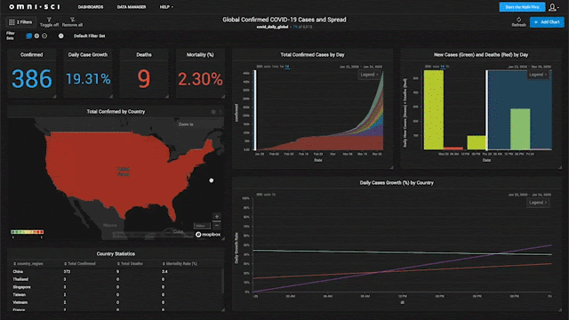
2. Dashboards
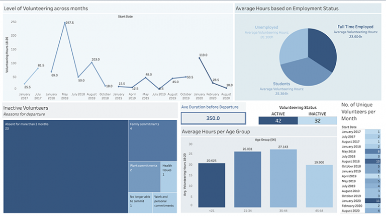
These are landing pages that show data changes in real-time so you can keep track of the queries that you use most often.
3. Charts and Graphs
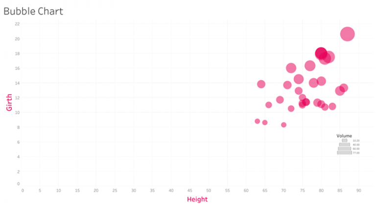
These present data in a simple way, like your classic elementary school pie charts and bar graphs, but with mass amounts of data inputted and often interactive.
4. Maps
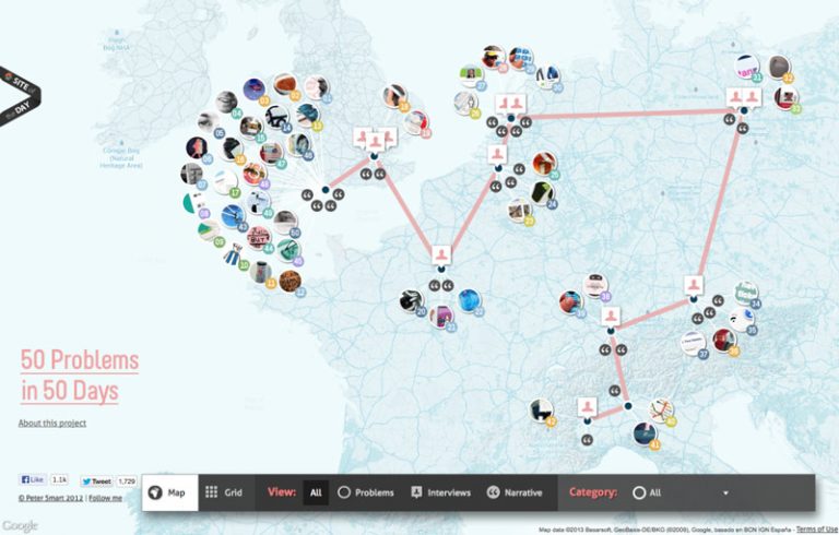
Location-specific data can be presented on a map, often using color to denote trends. These are most useful when interactive.
5. Infographics
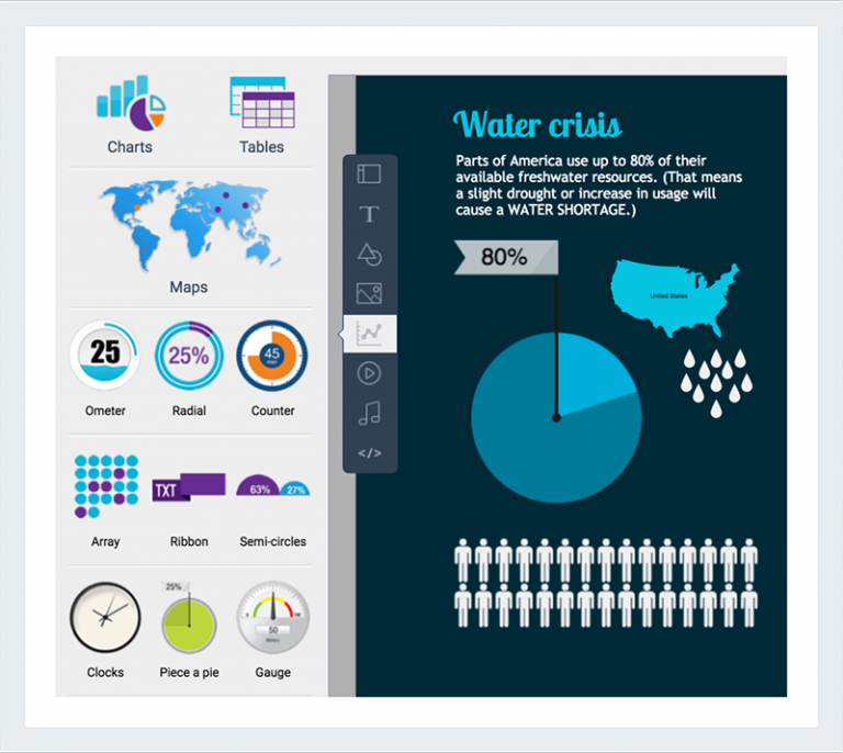
These are graphics that display data in a way that is easy to understand. These are most helpful for communicating statistics externally, such as on your website or in reports and blog posts.
Nonprofits Can Make More Impact with AI and Automation
1. To Make Data-Driven Decisions
Nonprofit data visualization tools are essential to your nonprofit’s decision-making process. You don’t need to be a data scientist to use a data visualization tool; they are built to break down the details in data, so anyone can interpret and understand them.
Some tools may require technical expertise to install and integrate with data sources, but almost anyone can learn to use them to harness data once the right tools are installed. Data visualization tools also amalgamate data. They can often be integrated with multiple data sources, so they will help you see trends across data sets, giving you a more holistic understanding of the patterns you see.
2. To Communicate Your Nonprofit’s Impact
Not only can nonprofit data visualization tools help you understand your data better, but they can also help you communicate your organization’s impact. You can translate your findings from the data to easily disseminate them to funders, donors, boards of directors, and other stakeholders.
In today’s landscape, funders want to see and understand your nonprofit’s impact, and donors want to see where their donation goes to. The best way to communicate this with them is visually.
7 Nonprofit Data Visualization Tools
There are many nonprofit data visualization tools available—each with its own strengths. The following is a list of nonprofit data visualization tools for every use case, so you can find the data visualization tool that will best fit your needs.
1. KIT
KIT integrates with your existing nonprofit CRM to analyze your donor and campaign data and build comprehensive dashboards and reports. This nonprofit-specific data visualization tool can help you make sense of your data by calculating important nonprofit and fundraising metrics and displaying them for you in a customizable dashboard.
Using KIT, you can weigh your data against industry benchmarks to evaluate your progress and identify growth opportunities. More so, you can pull visually appealing, presentation-ready reports and share them with stakeholders. You can learn more about KIT’s data visualization features here.
Get Timely, Actionable Donor Insights with Fundraising KIT
KIT helps you uncover patterns and trends in your donor data. It keeps you abreast of any changes in your donor behavior so you can adjust your strategy and stay on track to meet your goals.
2. Infogram
Infogram allows you to create interactive data visualizations in just a few minutes. While its capacity is limited to simple charts and infographics, they are aesthetically pleasing and can be added to reports, websites, or social media.
This tool is extremely easy to use—simply copy and paste data from a spreadsheet into the tool and you will quickly have an interactive graph, map, or chart. You can choose from their templates or customize your visuals and even collaborate on them with your team.
Infogram offers a limited free plan and has special pricing available for nonprofits as well.
3. Datahero
Infogram offers a limited free plan and has special pricing available for nonprofits as
Datahero allows you to create dashboards and charts through a very simple user interface. This tool connects with many different platforms, allowing you to draw insights from multiple sources, and with its dashboard feature, you can keep tabs on all your queries in one place. The dashboard is constantly updating, so you can stay on top of metrics at a glance (perfect for things like tracking KPIs).
Datahero offers a free trial but no free plan, so your window to test out the tool is limited.
4. Google Analytics
Google Analytics is the best tool for nonprofit marketing analytics, such as website and mobile app analytics. For example, if you are looking specifically to track how people are engaging with your organization’s website (i.e., Are they even getting to the donation page?), then Google Analytics is the right tool to use. It is also free to use. Beyond this use case, it is limited, and you’ll need to use it alongside other data tools.
5. Klipfolio
Much like Datahero, this tool is a business analytics tool that will give you a single dashboard to track internal statistics from a single place. This means it also integrates with many platforms you are already using. It is simple to use and works across organizations of all sizes.
What makes Klipfolio stand out is its ability to store historical data and show you trends over time, which can be extremely helpful. While it has limitations in its integrations and tracking applications, it is an excellent option for nonprofit organizations that need a dashboard.
Klipfolio offers a free version and a free trial, so you can test it out before buying.
6. Tableau
Tableau is a visual analytics platform that can handle a lot of big data. You don’t need robust technical knowledge or to be a data scientist to use Tableau. But there is a learning curve with the product, and it can be helpful to have some technical skills to get it running. Once you get used to the interface, you will be creating transforming data with ease!
Tableau allows you to create a user palette to present data in a way that is on-brand for your organization, perfect for preparing data for reports and presentations. Its biggest strength is arguably just how robust it is. As one of the more mature products in the market, they have a pretty wide offering of features and can handle complex data from various sources.
While they don’t have a free version, they have a Tableau Public tool you can access for free, though you do need to share the data publicly, so it is not ideal for private information. If you are a small nonprofit, you can also apply for a free license through Tableau’s Foundation.
7. Microsoft Power BI
Microsoft Power BI is considered by some to be the best data visualization tool available for its usability and ability to handle complex data. The most significant difference that this tool offers is its capability to analyze many data at once and still provide valuable insights instantaneously. It has a great user interface, making it easy for you to jump into and get the hang of it.
It also integrates with 70+ other products like Salesforce and Mailchimp, so it can amalgamate data from multiple sources and provide you with trends across various platforms. They have a selection of data visualization templates, as well as the ability to customize your own.
There is a limited free version of Microsoft Power BI available.
Monitor Your Fundraising Performance with this FREE Dashboard
Use this template to record your fundraising metrics so you can better communicate your progress with your team.
Start Visualizing Your Nonprofit Data
Now that you know the data visualization tools are available, start thinking about the data set you’ll like to visualize.
Do you want to create an infographic for your blog post or a dashboard to monitor your fundraising campaign performance? Once you decide what you want to achieve with your nonprofit data, choose the tool that works best for you and give it a try. The tools highlighted in this article have a free option, so you can test them out and see how they work for you.

Talk to a fundraising expert today to learn more about how Fundraising KIT can quickly and easily help your nonprofit raise more for your cause.

Ally Smith
Content Writer at Fundraising KIT
With a passion for nonprofit innovation, Ally has spent her career helping build community capacity and supporting social innovation as a customer success manager turned, youth worker, turned social researcher.
After leaving the tech start-up landscape, she pursued a Master’s in Philanthropy and Nonprofit Leadership and has since supported nonprofits to innovate and grow. A Canadian ex-pat and social entrepreneur based in Edinburgh, she enjoys hiking, baking bread in a panic, and pursuing the full Scottish experience- rain and rugby included!